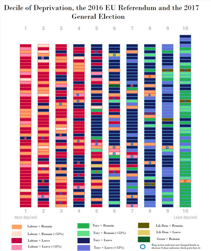
As I was saying about Deprivation and the vote...
Nov 1, 2017 2:36:54 GMT
YL, The Bishop, and 14 more like this
Post by Ghyl Tarvoke on Nov 1, 2017 2:36:54 GMT
In another thread I once again discussed this chart below in relation to Labour's supposed problems with Working Class voters and how this mostly is not a thing that exists to the extent the media and various pundits think it does.
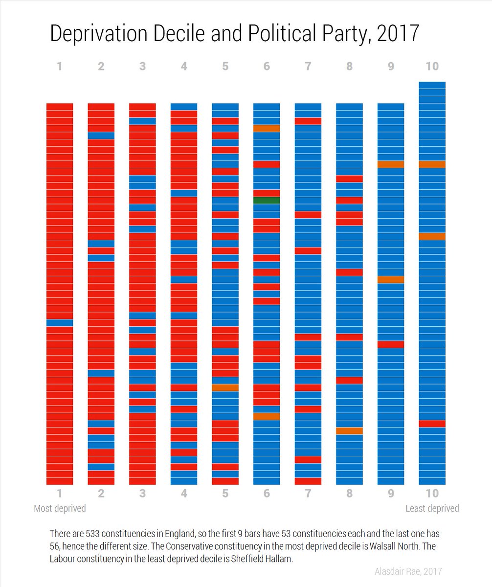
(I note that the Tory seats in the bottom four deciles are primarily a) seaside seats or b) in Lincolnshire or c) one of the handful of gains they managed back in June with a few exceptions none of which are particularly safe).
I added that if someone were to do a similar chart for the EU referendum it would look very different and would show the simple fact that the Leave vote was wealthier (wealth being a key word) than Corbyn's vote in aggregate.... well.... I went and did it, the absolute madman.
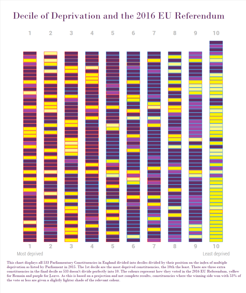
(I note that I did this on the quick so you can still see the blue and red outlines for many of the boxes, I wasn't going to do this perfectly... and it still took hours anyway. There may be some errors there, especially with the shading).
I used Political Scientist Chris Hanretty's projections of how each constituency voted - although this is known in some cases due to the release of ward results or the local Authority and constituency having conterminous boundaries - to give me my results. They are available on the Wikipedia article on the results of the referendum. As I stated above, many of these are just projections and so I gave an assumption of error of three points. That is I can't assume with certainty how one seat voted if the projected result was 53-47 either way or narrower. For that reason, I used a lighter shade of colour for those particularly close results. Reading Hanretty's analysis in detail I realize that I should have been stricter and made the error five points (so 55-45) but it wouldn't make that much difference. It's going to be fairly accurate or although perhaps with one or two errors around the edges.
And as you can see, I was right. Indeed, it's really noticeable how much 'Remain' drops off after you get past 25 or so least deprived constituencies. I note that there were more Remain voting seats in the 1st, most deprived, than in the 9th, second least deprived, decile (14 vs 12). This primarily represents urbanity and also the failure of Cameron and Stronger IN to do as well in the Home Counties as probably should, note how many of the seats in the 9th decile have the lighter shade of purple. Unlike with Labour, Parliament's Index of Total Deprivation is not a good predictor of either the Leave or Remain vote. To give another example, the 4th Decile contains the most Leave voting seats, with only 9 out of the 53 listed having voting Remain... but one of those nine is Streatham, held by Hanretty to be the most Remain of all seats.
The Number and Percentage of Remain seats by decile is below, holding all Hanretty's assumptions to be accurate
1st Decile (Most Deprived): 14 seats (26.42%)
2nd Decile: 17 seats (32.08%)
3rd Decile: 20 seats (37.74%)
4th Decile: 9 seats (16.98%)
5th Decile: 11 seats (20.76%)
6th Decile: 12 seats (22.64%)
7th Decile: 10 seats (18.87%)
8th Decile: 15 seats (28.3%)
9th Decile: 12 seats (22.64%)
10 Decile: 41 seats (73.21%)
Overall: 161 seats (30.21%)
What this all means I'll leave up to you. I'll just make some observations:
1. Even within the first and last deciles there was significant variation in comparison. In the first that should be obvious given it contains both Hull East and a lot of the worst parts of London. But even in smaller cities the results were notable so here are some of the results from within the 1st Decile with the Remain percentage rounded given in brackets: Liverpool Wavertree (64% Remain), Bethnal Green and Bow (69%), Hackney South and Shoreditch (78%), Liverpool Riverside (74%), Birmingham Hall Green (66.5%), Nottingham East (57%), Tottenham (69%), Manchester Gorton (62%), Manchester Central (63.5%), Birmingham Ladywood (64.5%)... Now there are some very common explanations to some of those results so I will merely point to overwhelmingly white working class Liverpool.
2. In the final decile while most seats were Remain very few were overwhelmingly so (>20 points margin) apart from the few in London there, Sheffield Hallam (the only Labour seat on the list, well was.... until, well, Jared O'Mara) and St Albans. However within that decile there is also a 68% Leave seat - Rayleigh and Wickford. There are also a few 60%+ Leave seats in the 9th Decile. Some Journalists to South Essex to discover these left behinds please.
3. There are very few safe Remain voting Tory seats below the 8th Decile, which perhaps shows how shallow and posh 'Tory Remain' was. The few exceptions are in London, where it's harder to segregate yourself as it is in the exurbs. The best example is the most deprived Tory-Remain seat now? The Cities of London and Westminster in the 5th decile. That fact should also tells us something about the limits of the analysis here.
4. The deprived Remain voting seats were terrible for the Tories at the election. What was the most deprived Tory-Remain seat before the election? Brighton Kemptown, in the 3rd decile.
5. Most of the Labour voting seats in the upper deciles are Remain gains - many of them 2017 gains like Hallam and Stroud. The ones that weren't tended to see significant swings against Labour, such as Penistone and Stockbridge.
6. The least deprived over 53% Leave seat is David Davis' Haltemprice and Howden
7. Again note how much light purple there is in the 9th decile. While I know in a referendum any vote anywhere is equal to any other vote there is a serious argument to be the made that it was not the North where the referendum was lost, or low turnouts in London and Scotland (whose turnouts would have been good or respectable for general elections) but in the Home Counties. Why did Cameron fail to bring these places, except the most wealthy, with him?
(I know most of you know this and are probably bored of analyzing the referendum results now, but hey, you don't have to read this)

(I note that the Tory seats in the bottom four deciles are primarily a) seaside seats or b) in Lincolnshire or c) one of the handful of gains they managed back in June with a few exceptions none of which are particularly safe).
I added that if someone were to do a similar chart for the EU referendum it would look very different and would show the simple fact that the Leave vote was wealthier (wealth being a key word) than Corbyn's vote in aggregate.... well.... I went and did it, the absolute madman.

(I note that I did this on the quick so you can still see the blue and red outlines for many of the boxes, I wasn't going to do this perfectly... and it still took hours anyway. There may be some errors there, especially with the shading).
I used Political Scientist Chris Hanretty's projections of how each constituency voted - although this is known in some cases due to the release of ward results or the local Authority and constituency having conterminous boundaries - to give me my results. They are available on the Wikipedia article on the results of the referendum. As I stated above, many of these are just projections and so I gave an assumption of error of three points. That is I can't assume with certainty how one seat voted if the projected result was 53-47 either way or narrower. For that reason, I used a lighter shade of colour for those particularly close results. Reading Hanretty's analysis in detail I realize that I should have been stricter and made the error five points (so 55-45) but it wouldn't make that much difference. It's going to be fairly accurate or although perhaps with one or two errors around the edges.
And as you can see, I was right. Indeed, it's really noticeable how much 'Remain' drops off after you get past 25 or so least deprived constituencies. I note that there were more Remain voting seats in the 1st, most deprived, than in the 9th, second least deprived, decile (14 vs 12). This primarily represents urbanity and also the failure of Cameron and Stronger IN to do as well in the Home Counties as probably should, note how many of the seats in the 9th decile have the lighter shade of purple. Unlike with Labour, Parliament's Index of Total Deprivation is not a good predictor of either the Leave or Remain vote. To give another example, the 4th Decile contains the most Leave voting seats, with only 9 out of the 53 listed having voting Remain... but one of those nine is Streatham, held by Hanretty to be the most Remain of all seats.
The Number and Percentage of Remain seats by decile is below, holding all Hanretty's assumptions to be accurate
1st Decile (Most Deprived): 14 seats (26.42%)
2nd Decile: 17 seats (32.08%)
3rd Decile: 20 seats (37.74%)
4th Decile: 9 seats (16.98%)
5th Decile: 11 seats (20.76%)
6th Decile: 12 seats (22.64%)
7th Decile: 10 seats (18.87%)
8th Decile: 15 seats (28.3%)
9th Decile: 12 seats (22.64%)
10 Decile: 41 seats (73.21%)
Overall: 161 seats (30.21%)
What this all means I'll leave up to you. I'll just make some observations:
1. Even within the first and last deciles there was significant variation in comparison. In the first that should be obvious given it contains both Hull East and a lot of the worst parts of London. But even in smaller cities the results were notable so here are some of the results from within the 1st Decile with the Remain percentage rounded given in brackets: Liverpool Wavertree (64% Remain), Bethnal Green and Bow (69%), Hackney South and Shoreditch (78%), Liverpool Riverside (74%), Birmingham Hall Green (66.5%), Nottingham East (57%), Tottenham (69%), Manchester Gorton (62%), Manchester Central (63.5%), Birmingham Ladywood (64.5%)... Now there are some very common explanations to some of those results so I will merely point to overwhelmingly white working class Liverpool.
2. In the final decile while most seats were Remain very few were overwhelmingly so (>20 points margin) apart from the few in London there, Sheffield Hallam (the only Labour seat on the list, well was.... until, well, Jared O'Mara) and St Albans. However within that decile there is also a 68% Leave seat - Rayleigh and Wickford. There are also a few 60%+ Leave seats in the 9th Decile. Some Journalists to South Essex to discover these left behinds please.
3. There are very few safe Remain voting Tory seats below the 8th Decile, which perhaps shows how shallow and posh 'Tory Remain' was. The few exceptions are in London, where it's harder to segregate yourself as it is in the exurbs. The best example is the most deprived Tory-Remain seat now? The Cities of London and Westminster in the 5th decile. That fact should also tells us something about the limits of the analysis here.
4. The deprived Remain voting seats were terrible for the Tories at the election. What was the most deprived Tory-Remain seat before the election? Brighton Kemptown, in the 3rd decile.
5. Most of the Labour voting seats in the upper deciles are Remain gains - many of them 2017 gains like Hallam and Stroud. The ones that weren't tended to see significant swings against Labour, such as Penistone and Stockbridge.
6. The least deprived over 53% Leave seat is David Davis' Haltemprice and Howden
7. Again note how much light purple there is in the 9th decile. While I know in a referendum any vote anywhere is equal to any other vote there is a serious argument to be the made that it was not the North where the referendum was lost, or low turnouts in London and Scotland (whose turnouts would have been good or respectable for general elections) but in the Home Counties. Why did Cameron fail to bring these places, except the most wealthy, with him?
(I know most of you know this and are probably bored of analyzing the referendum results now, but hey, you don't have to read this)
